It's perfection
Categories
Osaka Metro


It's perfection

More here https://design-milk.com/complements-handmade-chocolates-are-little-pieces-of-modular-art/


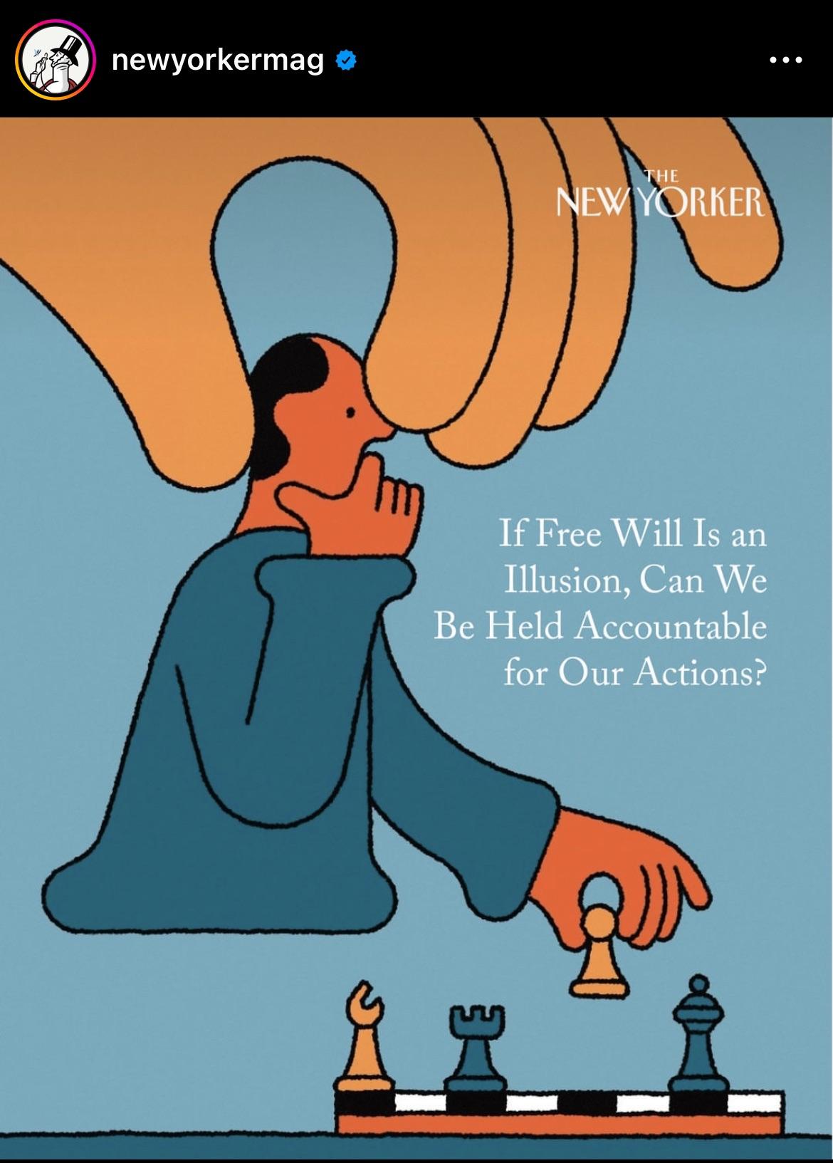
I stumble up on Till Laurer's illustration pieces for New York Times and curious the thought process of his. I was wondering how can I learn to develop this editorial illustration style. Would you guys recommend any online courses relating to this? Thank you so much




I kept looking at it trying to figure out why the text was stylized the way it is: “K_.ller” until I realized the bullet hole was positioned where the vertical “i” would be standing, then I realized the lowercase “i” resembles a stick figure, and in this logo, he's been shot, and laying down, dead.
